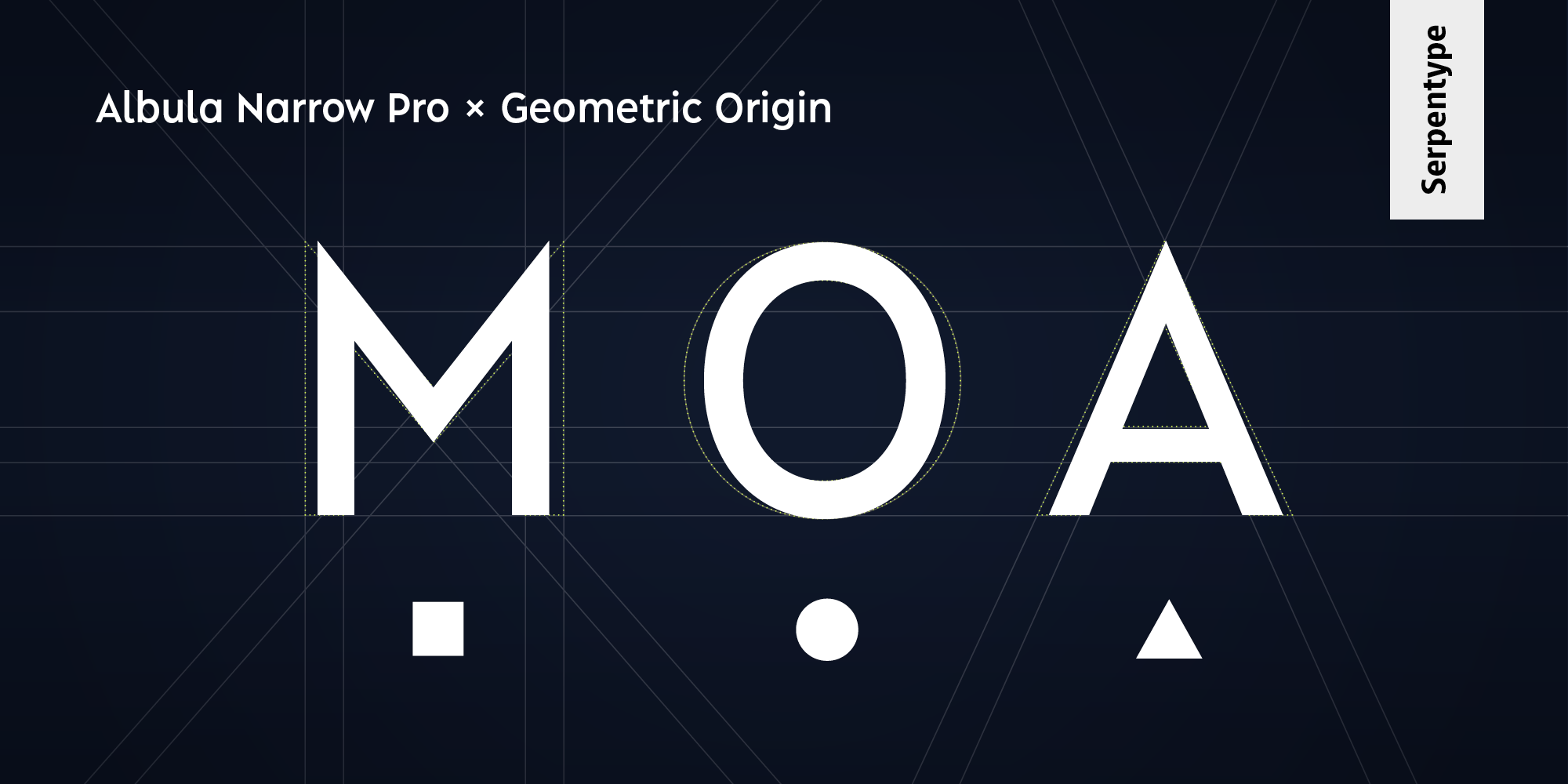
Albula Narrow Pro
Albula Narrow Pro
The Albula Narrow Pro completes the Albula typeface family. The distinctive stylistic expression of the Albula with its unique form-details is clearly noticeable. The clarity with the sharpness of the endings as well as the derivation from the basic geometric forms can still be felt. Thanks to its narrow appearance the Albula Narrow Pro is very well suited wherever compactness is required. This can range from applications in the field of branding to packaging design or signage. It’s a match even for narrow text columns and spreadsheets. As with its origin, during the development great importance was attached to legibility, so that a good reading experience is guaranteed, whether in a digital or analog use.
Designed by Silvio Meier
Produced by Sabina Chipară
-
Andreas Beugger – Photography – www.instagram.com/andreasbeugger
Sara Blaser – Content review – www.sprachwerk.ch
Dase Boogie – Motion Design – www.instagram.com/daseboogie
Sabina Chipară – Production – www.sabinakipara.com
Richard Frick – Expert review – www.schriftenfaecher.ch
Ivo Gabrowitsch – Marketing advice – www.fontwerk.com
Dominique Kerber – Expert review – www.schriftgestaltung.ch
Christoph Koeberlin – Expert review – www.christoph.koeberlin.de


