Albula Pro
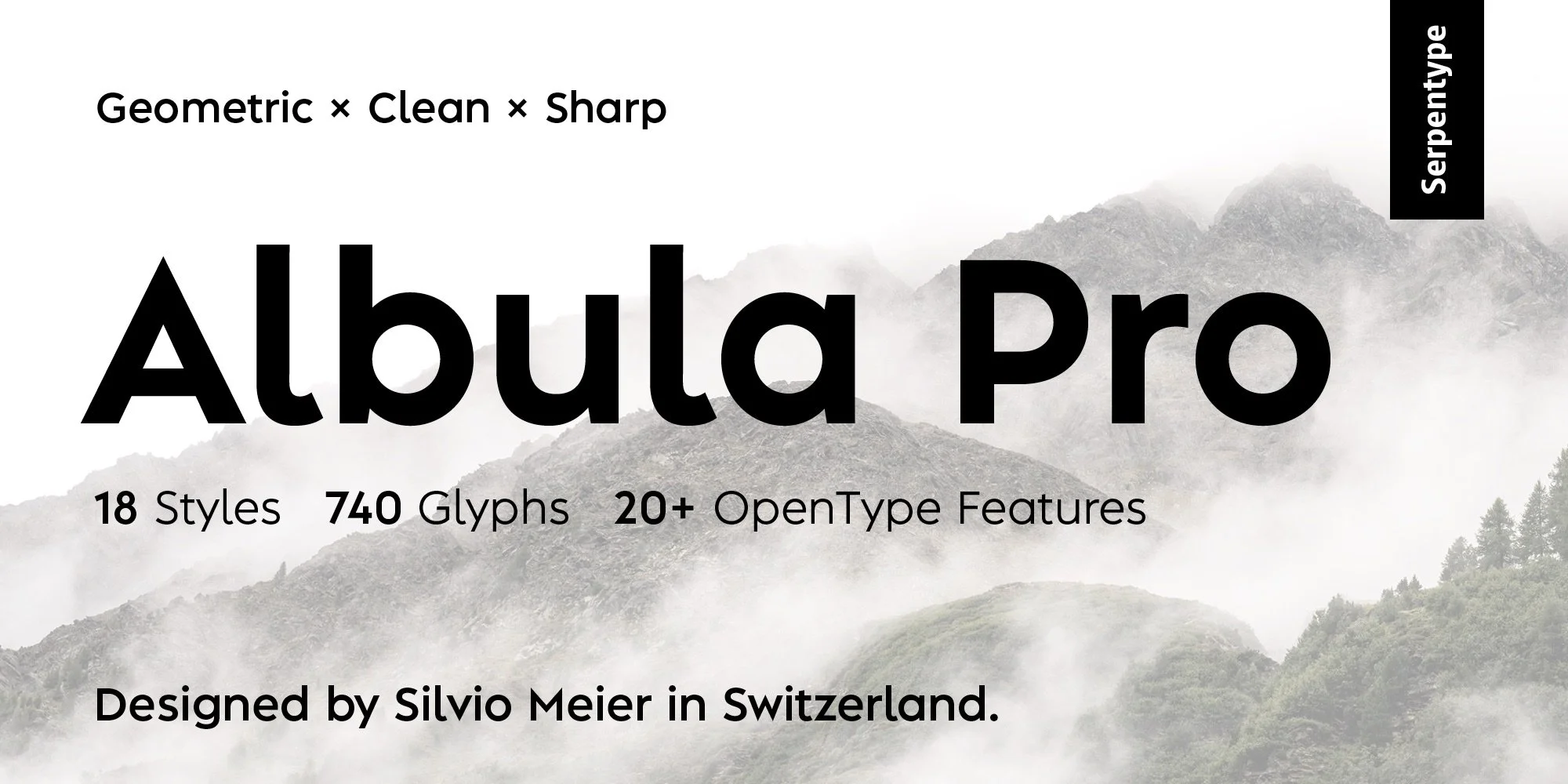
Albula Pro is a contemporary geometric sans with a charismatic touch.
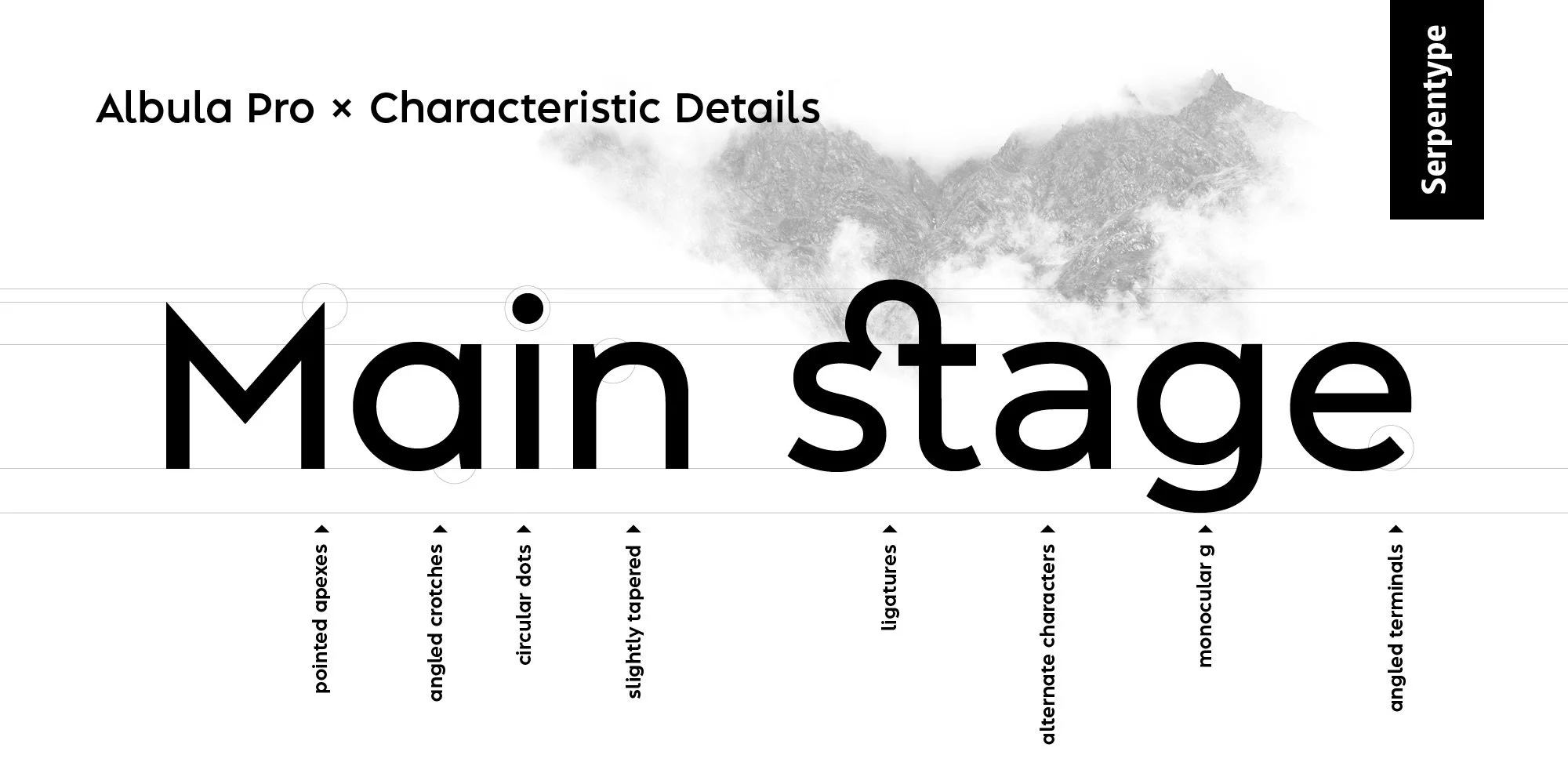
Inspired by geometry and enhanced with unique form-details. The shapes are optically corrected in order to ensure an excellent reading experience and a broad professional use. Albula Pro is an ideal choice to make your design and layout stand out. It performs perfectly in the headlines as well as for the branding purposes.
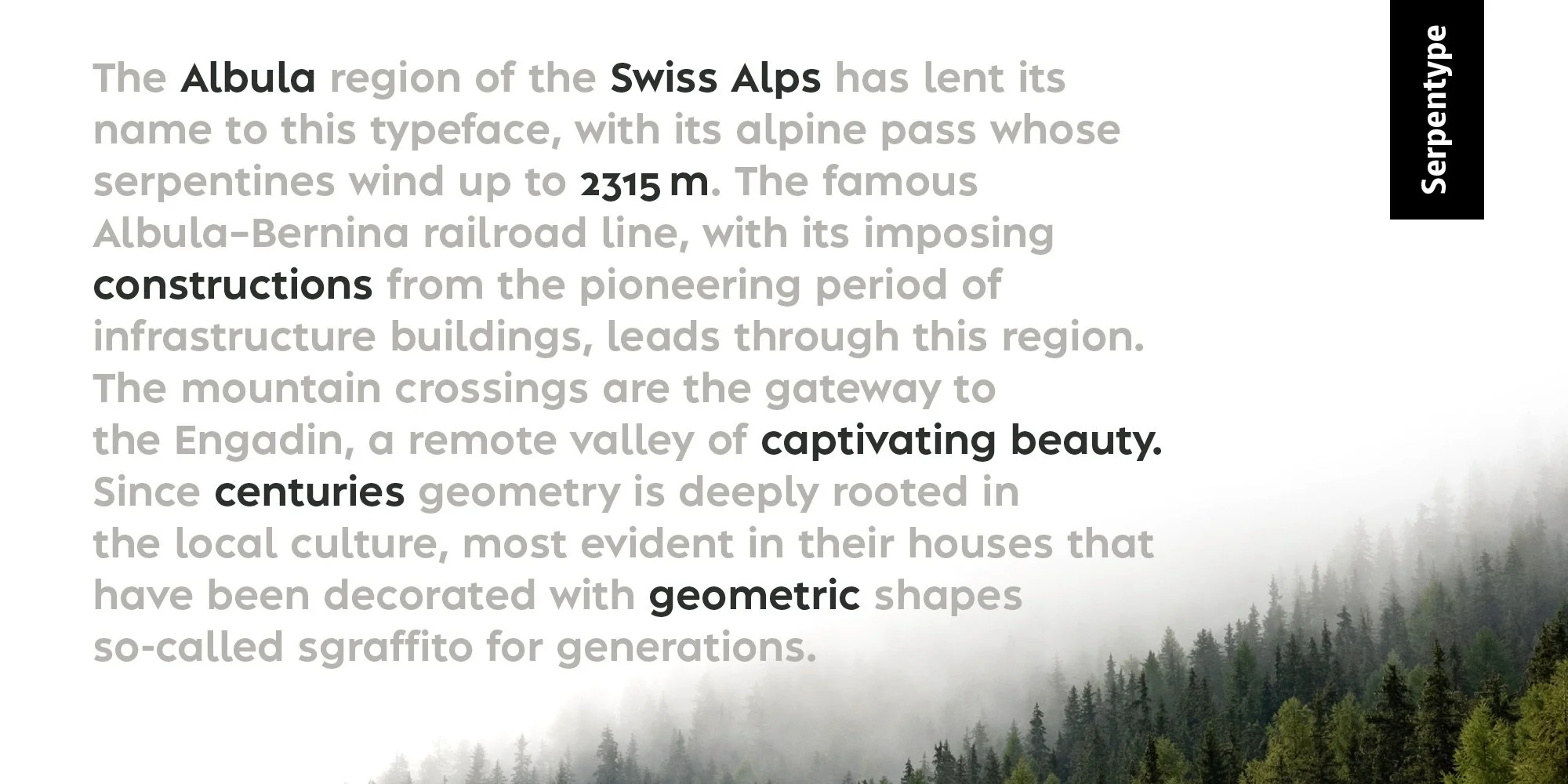
When designing Albula Pro, great importance was attached to legibility, so that a good reading experience is guaranteed regardless the text length, which makes it an excellent option for editorial content.
Designed by Silvio Meier
Mastering by Barbara Bigosinska
-
Andreas Beugger – Photography – www.instagram.com/andreasbeugger
Barbara Bigosinska – Mastering – www.bigosinska.com
Sara Blaser – Content review – www.sprachwerk.ch
Richard Frick – Expert review – www.schriftenfaecher.ch
Ivo Gabrowitsch – Marketing advice – www.fontwerk.com
Dominique Kerber – Expert review – www.schriftgestaltung.ch
Christoph Koeberlin – Expert review – www.christoph.koeberlin.de
Jonas Schudel – Expert review – www.sfgz.ch
Claudia Wildermuth – Concept development – www.bureauvue.ch


